Designing a user interface with Unity is done quickly, and the results may even look very appealing. But things become ugly as soon as you change the aspect ratio of your screen, testing your design on different smartphones or tablets. Fortunately, Unity includes a few tools to help you implementing a so-called Responsive Design. Here are three tips from my experiences with my current project, Network Traders.
Your best friend in the Unity editor is the Device Simulator which is available since Unity 2019.3. It contains a pretty long list of different screen configurations you can use to test your UI. Beside the “normal” configurations like older Galaxy S models, check out those with extreme specifications. The iPad 12, e.g., has an aspect ratio of 4:3, while a Motorola Moto G7 Power‘s is the opposite extreme, roughly 19.5:9 (6.5:3). The configurations also include the notch location of modern devices, rounded screen edges and the resulting “safe area”. My first tip is, use the Device Simulator to check those devices regularly and see, if your UI looks good on them, too.
Adjust your Layout Groups
Responsive Design is most important for your user interface. You do not want any buttons to be covered by a notch, or UI elements to overlap each other. The easiest way to create a UI that adapts to different screen sizes is to use layout groups. A very nice tutorial on them can be found here.

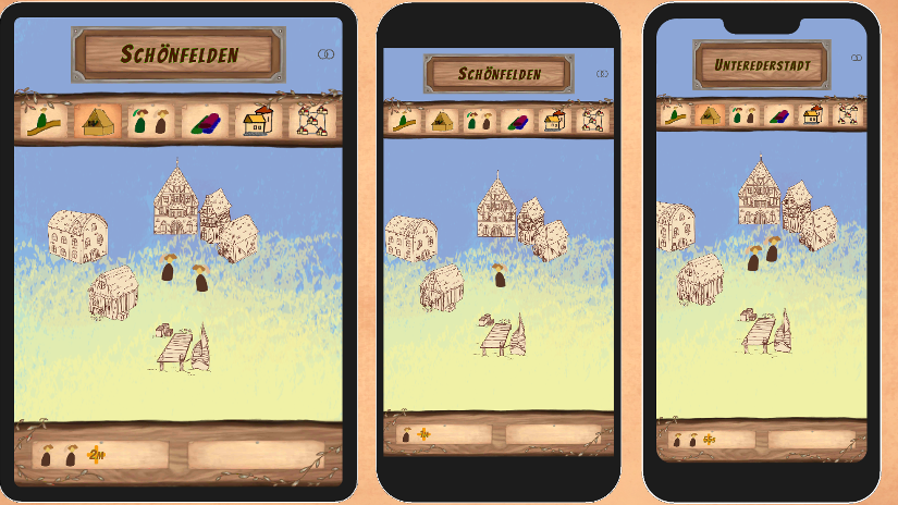
But sometimes, just having a layout group is not enough, especially when dealing with the infamous notch. In the example on the right, the notch interferes with the topmost UI elements. While it would be optimal to incorporate the notch and use the space beside it in some way, it is usually just avoided and the UI moved downwards.
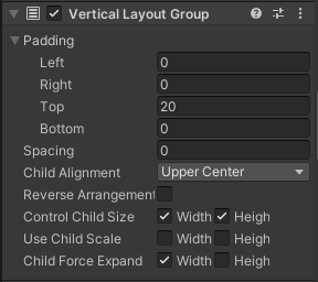
My solution for the notch problem is quite simple and straight-forward. I have written a small script which adjusts the VerticalLayoutGroup settings, moving the UI downwards into the safe area.
private void Start()
{
  VerticalLayoutGroup layout = GetComponent<VerticalLayoutGroup>();
  RectTransform rect = GetComponent<RectTransform>();

  RectOffset padding = layout.padding;
  padding.top += (int)((Screen.height - Screen.safeArea.yMax) / Screen.height * rect.rect.height);
  layout.padding = padding;
}
The Screen.safeArea property is very helpful here. Downward movement of the UI is achieved by just adding the safeArea size as top padding to the VerticalLayoutGroup of the screen-wide canvas. The code snippet can be used as part of an existing component or as a stand-alone component. If you want to avoid the rounded lower edge of the screen, you can do the same for the bottom padding.
Align Background and UI

Unfortunately, it gets worse when you need to align your background to fit into the visibly area behind your UI. On the right, you can see another example from Network Traders where a Responsive Design approach was called for. This is a little trickier since UI and background do not reside in the same coordinate systems.
The solution was another script which is added to the root GameObject of the background element. It receives two input values, BackgroundHeight and BackgroundPivotRatio, which describe the size properties of the background element to be adjusted. The first one is its height in Unity units, the second one a measure for how far it should be moved downward relative to its size (or in other words, how much space will be between it and the UI element).
private void OnEnable()
{
  float canvasHeight = MainCanvas.GetComponent<RectTransform>().rect.height;
  RectTransform menu = menu.GetComponent<RectTransform>();

  // position screen background vertically below menu
  float menuLowerBorder = (menu.rect.height / 2.0f) - menu.anchoredPosition.y;
  float menuRelativePositionY = menuLowerBorder / canvasHeight;

  float pivotRelativePositionY = menuRelativePositionY + (BackgroundHeight * BackgroundPivotYRatio) / (Camera.main.orthographicSize * 2.0f);

  transform.position = new Vector3(transform.position.x, Camera.main.orthographicSize - Camera.main.orthographicSize * 2.0f * pivotRelativePositionY, transform.position.z);
}
The rest of the script determines where, on the background, the menu has its lower edge and positions the background element below that.
If this looks too complicated to you, you might try one of the solution packages out there. E.g., download NotchSolution from GitHub, or try Safe Area Helper from the Unity asset store.