We put quite some thought and effort into creating an app icon for Network Traders. Finally, we have a version which is ready to be deployed. What do you think of our “flying merchant”? Read more about the design process and leave a comment about your first impression!
The times when our testers associated Network Traders with the Unity icon are finally over. I had a few ideas in my mind and Andrea has been busy drafting them out for the last couple of weeks. The merchants, travelling from device to device, are central to Network Traders. Therefore, and because we humans are just good at associating faces, a merchant had to be the main figure of our app Icon.
From Idea to App Icon
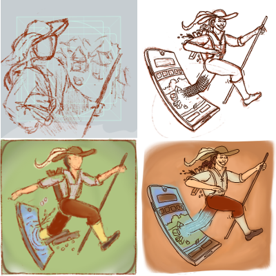
The app icon should reflect the main features of the game, which are certainly merchants and city building. The first icon sketches already reflected this. But what I consider the core feature of Network Traders is the travelling of the merchants from one device to another. So we soon homed in on a composition which also includes a smartphone the merchant is leaving for new markets and trade opportunities. The rest was lots of fine-tuning, little details (did you see the main screen village on the phone screen?), and, finally, colouring.
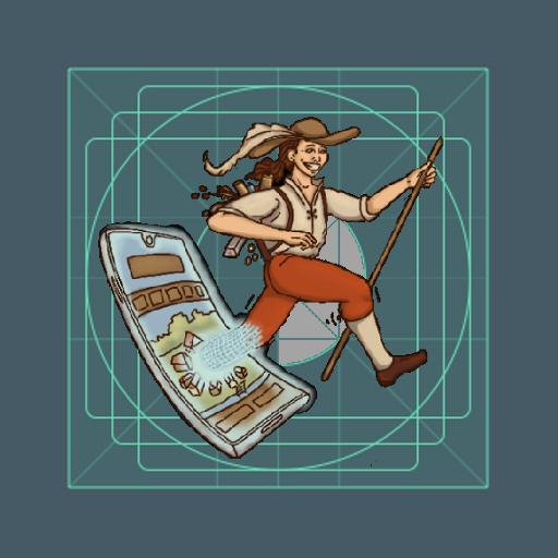
A very strange thing are the icon layout specifications of Google. The Android page on Google Play icon design holds lots of information about sizes and focus areas. An icon for the Google Play Store is supposed to be 512 by 512 pixels in size. But the actual app icon on your device is cropped by the circled area in the center shown on the left. Others have puzzled about this, too, so if you wonder how to handle this, this is what we did: take the actual icon, scale it to 344×344 pixels, and paste it onto a 512×512 pixels background. This way, the whole icon is visible on your device’s menu screen.
Your Opinion
What do you think about our icon? What is your first impression? I would very much like to hear your opinion! Is it actually possible to AB test an app icon? What are your criteria for selecting your final icon? Simply comment below, or leave a note on Twitter!